Showing posts with label Album Cover. Show all posts
Wednesday, 9 December 2015
Inspiration For New Digipak
Labels:
|Mood Board,
A2,
Advert,
Album,
Album Cover,
Analysis,
Audience,
Audience Profile,
Branding,
Conventions,
Digipak,
Direction Change,
Draft 1,
Existing Videos,
Media,
Music,
Music Video,
Real Media Products,
Research
Monday, 7 December 2015
Evaluation Question 1
Labels:
A2,
Adobe Premiere Pro,
Advert,
Album,
Album Cover,
Analysis,
Audience,
Band Members,
Conventions,
Decision,
Digipak,
Direction Change,
Evaluation,
Evaluation of Feedback,
Filming Update,
Final,
Joe Evaluation,
Media
Wednesday, 25 November 2015
Creative Journey
1)
The idea I started with was having a picture of
a Small Ruin in a forest.
2)
Then I had an idea of having just a picture of a
forest or the idea of having the front cover based on nature.
3)
Having a trippy image on the front cover was one
of my ideas.
4)
I decided to not do a nature or trippy image and
copy a very simplistic idea of having the band members on the front of the
magazine. I have taken Ideas from the Album cover of mystery by Brent
McCollough with the black and white colour scheme and the simplicity of just
having the artist with the name of the album and the name of the artist on it.
5)
For my digipak I was going to use the three
pictures of band members on it. This is important because it gives the band
members so kind of identity.
6)
Where some of my ideas came from was the album
cover to the Pet shop boys, please. The simplicity and the gap between the
picture and the writing of the name of the band and album.
7)
Another of my main helpers and tips came from
the Pet Shop Boys album, actually. This is because of the simplistic nature of
the piece and the way that the two members of the band have been cut out and
placed against a white background.
8)
Jay-z’s ‘the black album’ was something I used
for the font types and the idea of having the album name below the name of the
group or artist.
9)
The two Weezer album covers have been very
influential because of the simplicity of the two pieces. The idea of having
just the band members on the cover is one I took and I was also interested in
the way that they had the same kind of font for both the albums and that they
use it in a good way.
10)
ACDC highway to hell I used as an example for
the way the name of the band and album is set out. I was contemplating having
the name of the album below the image and the name of the band above the image.
11)
The backstreet boys album cover is one I like
because of the simplicity but also it has the band members and then the name of
the band above it. I took the idea of the band members onto my digipak.
12)
The razorlight album cover is one of my main influences;
this is because it is very simplistic. Having the band with the white
background behind it was very appealing just like the Pet shop boys albums. I
was contemplating having the band name in large like on the Razorlight album but
that would have made it too close to it so I went against that idea.
13)
The ‘Our Last Night’ album was going to be used
as inspiration as I was contemplating using the black or white background but
with then the band members on the strips with a different colour.
14)
This is the image I have used for the front
cover of the band members. What I did was cut each member out one by one and
added them to a white background.
15)
The white line which I am going to use as part
of the album title, as a separator between the name of the band and the album.
16)
The different fonts I could have used for the
name and title of the band and album respectively.
17)
The colour panel I used for the album. Very
basic and simplistic as this is the kind of feel I wanted for my album.
18)
The finished Digipak.
Monday, 23 November 2015
Sunday, 22 November 2015
Thursday, 5 November 2015
Responding to Feedback- Ben Wakeford Digipak
Front cover, Picture was just of the lead singer and the
text was slanted across the top of the singer’s head. On my new front cover I changed the picture
to accommodate the whole band. The band are cut out with the lasso tool on
Photoshop. I used the rectangle tool in
order to get a white background on the front cover then used the colour overlay
in order to make the background look the whitest it can be. I also changed the
name of the album to make it sound better; I changed it from the Undercover
Martyn to Expensive Sound. This is because Expensive sound is one of the names
of the songs and I thought it sounded better to me. I changed the Font type to
Calibri because this is a simpler font and it is easier to read than the
slanted font over the artist.
Back, on my first draft the back cover was a black
background which I did using the rectangle tool on the back cover. I then used
text boxes in order to make the song names. On my new digipak I changed the
back cover to not have the numbers down the side and just have the names of the
songs; this makes it easier to read. I also took the ‘Small Ruin’ away from the
top of the list because people would already know the band is called that. The
back is now very simplistic like the rest of the digipak.
Tray disk, On the first tray disc I had one of the Small
Ruin logo’s. I changed this from the disc because it was just a bit too much
for the viewers to take so I changed it to a plain white background using the
rectangle tool. On top of the white background I had the address to the
Facebook, Twitter and online pages.
On the extra panel, I had that the it was the Small Ruin
debut album. I also had a few reviews from people and magazines in music. On
the new digipak I scrapped the extra panel and just had four panels.
Inside left, On the inside left of my old digipak I had the
name of the Band and the names of all the band members. Also I had a message
from the band, I decided to take these off because the message was a bit
‘cringy’ and wasn’t needed. This is one of the sides that I took off because of
the needlessness of the panel.
Inside Centre, On the inside centre of my old digipak there
was a picture of the band. I decided to take this out on my new digipak because
of the picture of the whole band being on the front cover.
Monday, 26 October 2015
Wednesday, 21 October 2015
Friday, 2 October 2015
Digipak Ideas - Lead Singer Cover
After considering different ideas and taking inspiration from other album covers and looking through the book: 'Album' by Nick De Ville. At the moment I have chosen to just use the lead singer on my album cover. There are other famous examples of this being used...below are a selection:
Thursday, 1 October 2015
Digipak Style ideas
This first digipak design is a simple two-panel design. There is no insert but there are lyrics printed on an image in the inside cover. Although, what really drew me to this design is the cut out style on the CD holder. It's something different and adds good effect to the design.
This six-panel design show consistency by keeping the same colour pattern and design across all six panels. This consistency makes the cover look professional and finished to a good standard. The disk also features a design relating the artist/album cover and adds an extra effect to the digipak. the printed lyrics on one panel and some notes from the band's lead singer on another give an added bonus to the album. It may also entice fans to buy it because they are interested to read what they have to say about the album.
The piano image consistent across all 3 panels provide a good effect to this digipak. What also appeals tome is the sleeve insert on the first panel. This provides the opportunity to add something extra to the album, maybe a poster or some notes from the band themselves.
Labels:
A2,
Album,
Album Cover,
Analysis,
Audience,
Decision,
Digipak,
Ideas,
Indie,
Individual Work,
Inspiration,
Joe Ford
Digipak Inspiration // Joe Ford

This album cover is from 'Garbage' by Bones. The first thing that drew me to this album cover was the white noise effect across the middle. It is designed to give the effect as if it's losing signal. It blurs out his face and conforms to the grainy effect of the rest of the image surrounding him. This effects is also seen in the single taken from this album, 'ribs'.
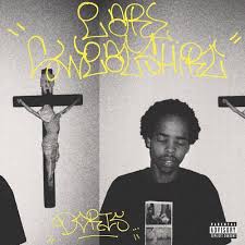
Again, the grainy, olden look to this album cover is what immediately appealed to me. the graffiti style writing in the background is used to good effect as it fits perfectly with the mise en scene of the image and also adds colour to the image which draws the attention of passers-by.
This album cover is from 'easy easy' by King Krule. The abstract artwork really strikes the attention at first glance and draw you in to look closer. The artist or designer may have took inspiration from an 'Escher' painting. The colours and way the image is worked with the reflection at the bottom definitely shows some similarities.
The simple nature of this album cover used for one of 'Mura Masa' singles really interested me at first glance. We see the grainy style used on the image used to great effect again and is something I am hoping to use in my own digipak.
Labels:
A2,
Album,
Album Cover,
Band,
Blog,
Coursework,
Digipak,
Joe Ford
Tuesday, 29 September 2015
Digipak - Initial Ideas And Inspiration // Nathan Beard
This is the powerpoint presentation with my initial ideas and inspiration for my digipak cover art.
Subscribe to:
Posts (Atom)