
Showing posts with label SmallRuin. Show all posts
Showing posts with label SmallRuin. Show all posts
Monday, 18 April 2016
Dear moderator
Dear moderator, welcome to our blog. Please use the labels on the right hand side to navigate our work. Work has been split into three main categories; Research and Planning, Product, Evaluation and where work has been produced by just one group member it has been labelled with their name
Friday, 22 January 2016
Monday, 18 January 2016
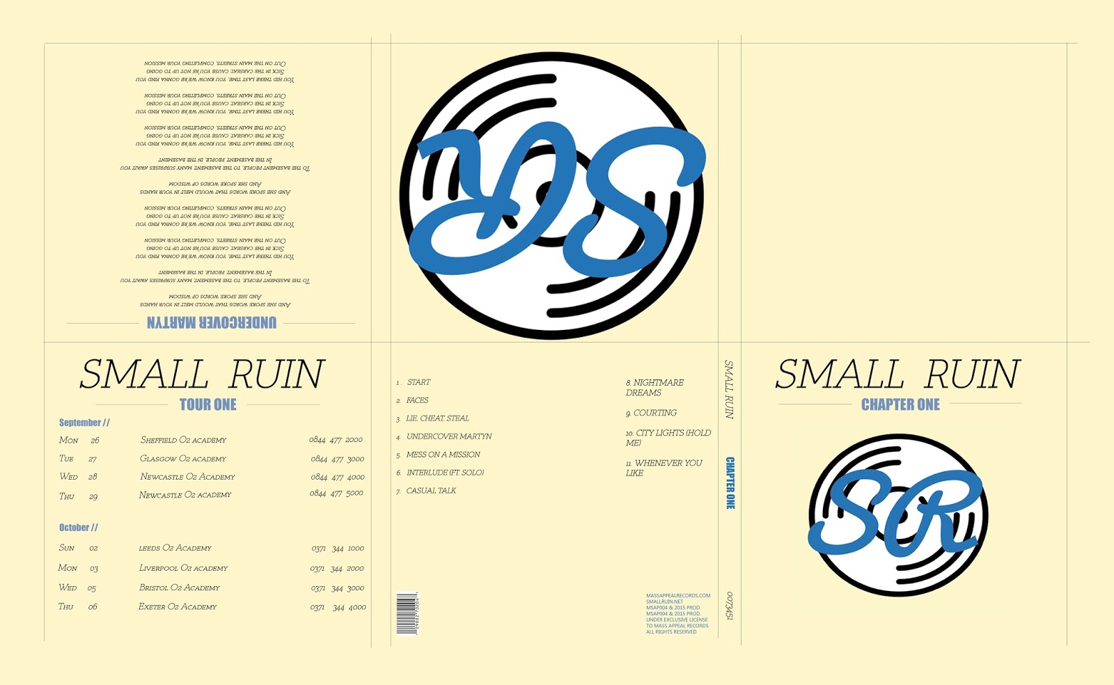
Final Digipak And Advert // Nathan Beard
Digipak

Advert
I have a few different adverts, with different text/logo combinations on the bottom.


Sunday, 17 January 2016


Friday, 15 January 2016
Saturday, 19 December 2015
Evaluation Question 2
How effective is the combination of your main product and ancillary texts?
Firstly, my ancillary tasks, the digipak and advert, I made a purposeful effort to consider both when planning for the design of my digipak, this allowed me to create a brand image that would be present across all of the elements of the band. The idea for the branding of the band came form the brief I initially set of 'simple but memorable'.
I believe that the designs with true coherence, are created with the development of the materials, shapes, colour caried out simultaneously, as this allows each element to accent and complement each other, this allows for a meaningful design that allows for a level of consistency through the elements and infact the products themselves. This aided me in creating a consistent brand that makes the band recognizable.
My digiapk is a 6 panel design, with the main part being the three circles on the cover, this sets the tone for the design of both the digipak and the advert, with the circles design caring on to the inside panels with a circle for each member, which clarifies the branding of the three circles each representing a band member. The circles theme is further applied to the back cover where they are used a s bullet points to list the songs.
The magazine advert also embraces this theme in order to maintain the brand image and make it easily recognizable, consisting of the cover image from my digipak and some text to let the audience know what they are looking at.
When we where creating our video it was important to take into account the genre of the music, in this case indie. As this ultimately impacts on the viewers and therefore it is extremely important to conform to a style they like. The style of this video is very much influenced by the style of my digipak with blurs being used to link to semi transparent glass like elements of my digipak and advert.
A further consideration throughout the process were the fonts as these would be used in every product, therefore they had to be flexible and fit not only in a logo but also a digipka, advert and music video. However given that the fonts work, they successful link the elements together.
Overall I believe that a successful and purposeful link has been created between all of the products, and that the brand image that has resulted portrays the band well.
Overall I believe that a successful and purposeful link has been created between all of the products, and that the brand image that has resulted portrays the band well.
Thursday, 26 November 2015


Wednesday, 25 November 2015
Update - Story Board
Today we have been refining our new story board as we changed our idea quite significantly form the original plan. This has been a lengthily process as it requires a lot of ideas and creativity as well as focus in order to get a good story board, in the next could of days it will be posted on the blog and we will complete an 'animatic' version of it.


Picture: Shot ideas we were coming up with
Creative Journey

1)
The idea I started with was having a picture of
a Small Ruin in a forest.
2)
Then I had an idea of having just a picture of a
forest or the idea of having the front cover based on nature.
3)
Having a trippy image on the front cover was one
of my ideas.
4)
I decided to not do a nature or trippy image and
copy a very simplistic idea of having the band members on the front of the
magazine. I have taken Ideas from the Album cover of mystery by Brent
McCollough with the black and white colour scheme and the simplicity of just
having the artist with the name of the album and the name of the artist on it.
5)
For my digipak I was going to use the three
pictures of band members on it. This is important because it gives the band
members so kind of identity.
6)
Where some of my ideas came from was the album
cover to the Pet shop boys, please. The simplicity and the gap between the
picture and the writing of the name of the band and album.
7)
Another of my main helpers and tips came from
the Pet Shop Boys album, actually. This is because of the simplistic nature of
the piece and the way that the two members of the band have been cut out and
placed against a white background.
8)
Jay-z’s ‘the black album’ was something I used
for the font types and the idea of having the album name below the name of the
group or artist.
9)
The two Weezer album covers have been very
influential because of the simplicity of the two pieces. The idea of having
just the band members on the cover is one I took and I was also interested in
the way that they had the same kind of font for both the albums and that they
use it in a good way.
10)
ACDC highway to hell I used as an example for
the way the name of the band and album is set out. I was contemplating having
the name of the album below the image and the name of the band above the image.
11)
The backstreet boys album cover is one I like
because of the simplicity but also it has the band members and then the name of
the band above it. I took the idea of the band members onto my digipak.
12)
The razorlight album cover is one of my main influences;
this is because it is very simplistic. Having the band with the white
background behind it was very appealing just like the Pet shop boys albums. I
was contemplating having the band name in large like on the Razorlight album but
that would have made it too close to it so I went against that idea.
13)
The ‘Our Last Night’ album was going to be used
as inspiration as I was contemplating using the black or white background but
with then the band members on the strips with a different colour.
14)
This is the image I have used for the front
cover of the band members. What I did was cut each member out one by one and
added them to a white background.
15)
The white line which I am going to use as part
of the album title, as a separator between the name of the band and the album.
16)
The different fonts I could have used for the
name and title of the band and album respectively.
17)
The colour panel I used for the album. Very
basic and simplistic as this is the kind of feel I wanted for my album.
18)
The finished Digipak.
New Band Member Recruited
We have now been able to cast a replacement band member for Max (who is now permanently unavailable). And he will be introduced to the song and video ideas today ready for filming tomorrow.
We contacted a significant number of potential candidates, many candidates weren't available for briefing and filming on the three day we had chosen and therefore were unsuitable for the role.
In the end we narrowed it down to two candidates and chose Louis Grocott for the role.
We are happy with this decisions and see Louis to be a valuable addition to the team.
Monday, 23 November 2015
Band Member Permanently Unavailable
Due to a change in circumstances one of our band members is now unavailable to film anything by the deadline, and we are therefore having to re-cast that part which will be a challenge this close to the deadline (less than a week). However we are putting in every effort to make this possible and make the transition form one to another seamless.
Friday, 20 November 2015
Filming Dates
We have decided that we are going to film on the 26th and 27th of November, this will be at the location we plan to shoot in Leicester City Centre. The shots will be taken in places similar to those in the location mood bards of the urban environments, the lighting for our video is a mixture between sundown type lighting and darker more night like lighting. For this reason we are going to film from about 5PM until we finish with the shots we need on each day.
One of our band members is unavailable on one of the days so all of the shots relating to him will be done on the 27th.
The test shots taken on 20/11/15 were not of satisfactory quality and will only be used to demonstrate a vague representation of the ideas we have.
One of our band members is unavailable on one of the days so all of the shots relating to him will be done on the 27th.
The test shots taken on 20/11/15 were not of satisfactory quality and will only be used to demonstrate a vague representation of the ideas we have.
Filming Plan
Today we are planning to film for the draft music video, due to the fact that two of the band members are unavailable for filming today we are filming the lead singers parts. so that we can get some feedback on the style of video.
- The idea of the filming is to get a feel for the concepts that we are using and decide wether they are to be used in the final video.
Wednesday, 11 November 2015

Thursday, 5 November 2015
Responding To feedback // Nathan Beard
This was my first draft for this style:

The feedback i received on my digipak was primarily focused around the positioning of some items. The items that needed repositioning where:
- The Logos of the band and record label on the left inside cover needed making smaller.
- The record label logo on the back cover needed moving to the other side.
- The 'welcome' text on the inside left cover needs aligning better.
Other comments that where made:
- Could do with more songs.
- Needs a catalog number on the margin.
- legal information needs adding to the bottom of the back cover.
- Change the word 'digipak' to album and change 'The SmallRuin Team' to SmallRuin.
This was the resulting digipak with the changes made:

I changed most of the aspects that where commented on however I decided that I didn't need to change the amount of songs, as I think that it sits better with less songs, as the version I tried looked cluttered due to the blue blobs being to regular.
Original Poster

Original Poster

The feedback I received was that that the design was good, and that I should try some of the following versions:


- Move the 'SmallRuin' script above the album name.
- Try one with the record logo on.
- Correct the spelling error.
New poster 1:

New poster 2:

My personal preference out of the above options would be the 3rd so the 2nd new one (with the record label logo) as this promotes the record label as well as the new album.
Responding to Feedback- Ben Wakeford Digipak
Front cover, Picture was just of the lead singer and the
text was slanted across the top of the singer’s head. On my new front cover I changed the picture
to accommodate the whole band. The band are cut out with the lasso tool on
Photoshop. I used the rectangle tool in
order to get a white background on the front cover then used the colour overlay
in order to make the background look the whitest it can be. I also changed the
name of the album to make it sound better; I changed it from the Undercover
Martyn to Expensive Sound. This is because Expensive sound is one of the names
of the songs and I thought it sounded better to me. I changed the Font type to
Calibri because this is a simpler font and it is easier to read than the
slanted font over the artist.
Back, on my first draft the back cover was a black
background which I did using the rectangle tool on the back cover. I then used
text boxes in order to make the song names. On my new digipak I changed the
back cover to not have the numbers down the side and just have the names of the
songs; this makes it easier to read. I also took the ‘Small Ruin’ away from the
top of the list because people would already know the band is called that. The
back is now very simplistic like the rest of the digipak.
Tray disk, On the first tray disc I had one of the Small
Ruin logo’s. I changed this from the disc because it was just a bit too much
for the viewers to take so I changed it to a plain white background using the
rectangle tool. On top of the white background I had the address to the
Facebook, Twitter and online pages.
On the extra panel, I had that the it was the Small Ruin
debut album. I also had a few reviews from people and magazines in music. On
the new digipak I scrapped the extra panel and just had four panels.
Inside left, On the inside left of my old digipak I had the
name of the Band and the names of all the band members. Also I had a message
from the band, I decided to take these off because the message was a bit
‘cringy’ and wasn’t needed. This is one of the sides that I took off because of
the needlessness of the panel.
Inside Centre, On the inside centre of my old digipak there
was a picture of the band. I decided to take this out on my new digipak because
of the picture of the whole band being on the front cover.


Friday, 16 October 2015

Subscribe to:
Posts (Atom)