

Showing posts with label Digipak. Show all posts
Showing posts with label Digipak. Show all posts
Sunday, 17 January 2016
Friday, 15 January 2016
Monday, 21 December 2015

Sunday, 20 December 2015
Saturday, 19 December 2015
Evaluation Question 1
In what ways does your media product use, develop or challenge forms and conventions of real media products?
Video
When we where in the research stage, watching established music video we discovered a few trends (conventions), that generally are followed by most videos. The most common of these conventions is the disjuncture, amplification, performance and narrative styles of video. This convention is very rarely broken.
We have carried this convention into our final video as we have used the narrative style of video. This is due to the fact that the original video for our song heavily features instruments and is a performance based video, this combined with the fact that throughout our extensive research we found that narrative based 'cinematic' style videos are some of the most successful.
Our video also followed conventions based on the clothing and framing we used throughout our video, the mise en scene fitted with the image pre-associated with the genre of music (indie) we also used framing that is consistent with that used in real media products, these include close up shots and mid shots of the main singer, this is used in order to create a bond between fans and the lead singer.
The primary area that our video breaks conventions is in that most videos for songs of our genre (indie) are performance based. Another aspect of convention that our video breaks is that typically real media products used advanced camera equipment, by contrast, for our video we used the camera on the iPhone 6s Plus, this records in 4K resolution and features OIS so along with a professional camera application (in this case FiLMiC Pro) in order to allow manual control over aspects such as focus and exposure, it can produce results equal to a mid to high end DSLR.
Overall our video both embraces certain conventions of established music videos and rejects other conventions that are perhaps now outdated.
Ancillary
Digipak
For my digipak, as with the video I heavily researched existing texts such as the xx, AM by Arctic Monkeys, Blue Monday by New Order and The Dark side of the Moon by Pink Floyd (pictured below) and analysed their features and what made them successful (or not). This gave me a real sense of the elements of digipaks that are carried throughout most examples, these conventions where plentiful, an example of a convention in digipaks is that typically they feature artwork in the center and then text above and below, typically the band name above and the album name below. I followed this convention in my digipak (and my advert) as I felt it carried an air of sophistication. Another convention that I embraced is the order of items on the spine (Band,Title,Catalog Number).
During my research I found that the very best digipkas where minimalist in their design language, this is a form of convention that is used more and more frequently now.
Advert
For my magazine advert, like with the digipak and video I researched various existing products and analysed their features and their success as a result of these aspects. looking at these examples gave me an idea of the conventions that are used throughout most magazine adverts of this type, I found there to be many conventions, an example of a convention in adverts is that they typically have the artwork in the center of the magazine advert and then title text above and below, typically the information about the album below. I followed this convention closely in my advert as the convention creates a sense of simplicity. Another convention that I used is the use of a record label logo towards the bottom of the advert. This allows viewers to quickly realize who is behind the album.
The real products I looked at for ideas and to evaluate the conventions used in the adverts where mostly the magazine adverts for the digipaks above, as they fitted best with the style I wanted to follow. However There were a few more that I liked and took inspiration from, like the Kasabian poster.
Another convention I followed for my magazine advert is the idea of a link between the digipak and to an extent the video, this is widely used in the industry and creates an identity that links the elements to each other.
Overall our media products both follow an challenged various different forms of conventions, following the best aspects and differing in the worst.
Thursday, 17 December 2015
Evaluation question 1- Draft
Music video:
We wanted to make a narrative music video where the main
story of the song is shown in an easy way for the audience to understand. We didn’t
want to have instruments because we thought that the song would be better
staged as a narrative than a performance. We are developing the conventional
forms of media and what is perceived to be ‘normal’ in the music industry.
Traditionally the genre of music we are doing normally have
a performance style video with the examples of the Oasis, Wonderwall where they
are performing the video as a band. Other videos such as the Verve, Bitter
Sweet Symphony is a video we looked at and likes the idea of having the lead
singer walk down the street, but instead of having people around him have it
just the band member.
We developed this shot in the Verve video by doing a long
walking shot of the main individual and developing it slightly as we decided to
put shots in between it so it isn’t just one big continuous walk through of a
large part of the song. We did many different types of shots which developed
and challenged the forms and conventions of real media products, for example
using the close ups, mid shots and long shots. This was so the audience could
get a feel for the band and who the stars of the video are. Also having more
shots of one of the artists will get the audience to recognise which of the
artists is the most important to the band and the video.
Digipak and advert:
When I researched what to put on my digipak and the ideas
for it I struggled to find something that I would really like to use for my
digipak. In the end I found something, it was the simplistic idea of the pet
shop boys, actually. I really like this album cover because it is simplistic
and easy to look at on the eye. If it is this then it is then better for the
audience who are the people that are going to buy it. I feel like this idea
challenges the conventions of real media products because normally bands have
more going on within their CD covers but because mine is very bare and not very
busy this means that there is more chance that people will like it. People will
like it because there isn’t much of it to take in therefore it won’t make them
think too much about it because there isn’t much too it, this simplistic idea
gives my digipak an advantage against others because people who have used
complex idea will have lots going on within their digipak, this means that the
people who are going to purchase this digipak or album might not enjoy being
bombarded with lots of different colours and designs. A good example of a
simple digipak that fits in with the style of mine is the digipak for the
Mumford and Sons album, Sigh No More.
There is a simplistic design to this but there is also a bit of writing
on the back, where I have put my most writing.
While researching for the magazine advert I found lots of
adverts for bands such as Kings of Leon, Kasabian and the Foo Fighters. They
all are similar because they all have the same picture on the front as the
album cover does when the album actually comes out. For example the Foo
Fighters have the FF on the front surrounded by a red circle and in front of a
metal sheet. In this case I think I have used the ideas from existing media
products because for my magazine advert I decided to use the front cover
picture of my digipak as my magazine advert a long with having ‘OUT NOW’ below
this. This gives the image of the digipak and album in the heads of readers of
the magazines which means that if they see it In a shop then they will
recognise it and pick it up to look at it. This is why lots of famous bands and
artists use the same image from the album cover on the magazine advert to make
it look like the album and make it look recognisable for potential buyers and
fans.
Overall I feel that I developed different media products in
the music video, using different ideas and shot types in order to gain a better
grade and make a better video. This is different to the Digipak where I
challenged but also used different ideas from already made digipaks in order to
get the ideas and develop my own digipak. For the magazine advert I used the
ideas from a few different magazine adverts that have excisted for a long time
in order to get the best mark and to gain experience needed for the making of
my own magazine advert which will show the band in the best and most individual
way.
Evaluation Question 2- Draft
How
effective is the combination of your main product and ancillary texts?
For my main product, our task was to make a music video which
represented a type of music and the kind of artists that play this kind of
music. The ancillary texts we had to make to go along side this main product
was a Digipak and a magazine advert for the made up band and the new music they
are bringing out.
We are doing the Indie style of music. The indie style of
music should reflect the latest bands and trends in the music business and the
bands around at the time. It also must reflect the people who listen to the
music and buy the tracks and the albums as these are the people who buy the
albums.
When designing my advert and digipak I hadn’t got a very
clear idea of what I was going to do. So when my first draft wasn’t very good I
had to do a total revamp of the whole thing.
When I came across the Pet shop boys, Actually cover I
thought this would be a good cover to use as an example because the cover is
quite basic but looks very good and quite affective. I wanted to get this kind
of band style into the digipak and magazine advert because the band that we are
doing the music video from is this indie style.
This research I have done into this Digipak along with
magazine adverts made me believe that I had found many different form of media
convention that Indie genre’s use with magazine adverts or album covers. My
digipak was a four panel with the front, back covers and the inside left and
right. I have a picture of the band on the front which is very isolated so that
the audience can focus on them while they are looking at my digipak. The centre
image is the picture of the band which is organised so they are all wearing
white shirts so they look like they are a ‘unit’ or a group of individuals who
are friends and can work together to make good music.
Indie style is not the easiest thing to relate to a digipak
and to relay this information to the audience and buyers was the most crucial
thing in order to get the people to want to listen to the music and purchase
the digipak. When I was making my Digipak I didn’t think much how it would fit
into my video because our video is quite unique but also my Digipak is quite
unique but in different ways. The way that both the video and the digipak are
unique means that my work links in to also being unique, this unique style also
links into the ‘indie’ genre of music that we have with both the style of music
and the style of my digipak and music video both being quite individual. If i
had to complete the Digipak section of the coursework then I would find more
individual and Indie bands album covers in order to copy some sort of styling
from these which would take my grade higher than it is. I feel like my research
for the magazine advert was very minimal and just used the front cover of my
digipak in order to make it look the way that I wanted it too.
Overall I feel that I use the individuality of my digipak and
Advert and mixed that with the ideas we had for the video and I feel like the
two mix well to show a good idea of an indie band and music video.
Wednesday, 9 December 2015


Monday, 7 December 2015
Wednesday, 25 November 2015
Creative Journey

1)
The idea I started with was having a picture of
a Small Ruin in a forest.
2)
Then I had an idea of having just a picture of a
forest or the idea of having the front cover based on nature.
3)
Having a trippy image on the front cover was one
of my ideas.
4)
I decided to not do a nature or trippy image and
copy a very simplistic idea of having the band members on the front of the
magazine. I have taken Ideas from the Album cover of mystery by Brent
McCollough with the black and white colour scheme and the simplicity of just
having the artist with the name of the album and the name of the artist on it.
5)
For my digipak I was going to use the three
pictures of band members on it. This is important because it gives the band
members so kind of identity.
6)
Where some of my ideas came from was the album
cover to the Pet shop boys, please. The simplicity and the gap between the
picture and the writing of the name of the band and album.
7)
Another of my main helpers and tips came from
the Pet Shop Boys album, actually. This is because of the simplistic nature of
the piece and the way that the two members of the band have been cut out and
placed against a white background.
8)
Jay-z’s ‘the black album’ was something I used
for the font types and the idea of having the album name below the name of the
group or artist.
9)
The two Weezer album covers have been very
influential because of the simplicity of the two pieces. The idea of having
just the band members on the cover is one I took and I was also interested in
the way that they had the same kind of font for both the albums and that they
use it in a good way.
10)
ACDC highway to hell I used as an example for
the way the name of the band and album is set out. I was contemplating having
the name of the album below the image and the name of the band above the image.
11)
The backstreet boys album cover is one I like
because of the simplicity but also it has the band members and then the name of
the band above it. I took the idea of the band members onto my digipak.
12)
The razorlight album cover is one of my main influences;
this is because it is very simplistic. Having the band with the white
background behind it was very appealing just like the Pet shop boys albums. I
was contemplating having the band name in large like on the Razorlight album but
that would have made it too close to it so I went against that idea.
13)
The ‘Our Last Night’ album was going to be used
as inspiration as I was contemplating using the black or white background but
with then the band members on the strips with a different colour.
14)
This is the image I have used for the front
cover of the band members. What I did was cut each member out one by one and
added them to a white background.
15)
The white line which I am going to use as part
of the album title, as a separator between the name of the band and the album.
16)
The different fonts I could have used for the
name and title of the band and album respectively.
17)
The colour panel I used for the album. Very
basic and simplistic as this is the kind of feel I wanted for my album.
18)
The finished Digipak.
Monday, 23 November 2015
Sunday, 22 November 2015

Wednesday, 11 November 2015
Thursday, 5 November 2015
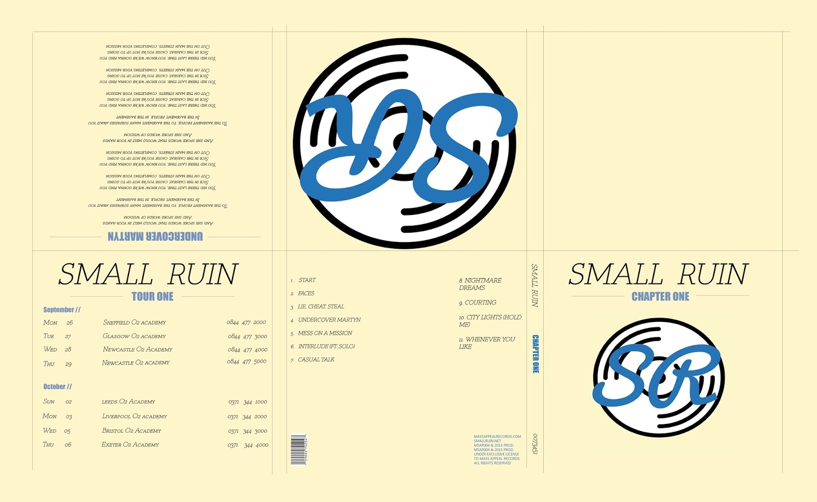
Responding To feedback // Nathan Beard
This was my first draft for this style:

The feedback i received on my digipak was primarily focused around the positioning of some items. The items that needed repositioning where:
- The Logos of the band and record label on the left inside cover needed making smaller.
- The record label logo on the back cover needed moving to the other side.
- The 'welcome' text on the inside left cover needs aligning better.
Other comments that where made:
- Could do with more songs.
- Needs a catalog number on the margin.
- legal information needs adding to the bottom of the back cover.
- Change the word 'digipak' to album and change 'The SmallRuin Team' to SmallRuin.
This was the resulting digipak with the changes made:

I changed most of the aspects that where commented on however I decided that I didn't need to change the amount of songs, as I think that it sits better with less songs, as the version I tried looked cluttered due to the blue blobs being to regular.
Original Poster

Original Poster

The feedback I received was that that the design was good, and that I should try some of the following versions:


- Move the 'SmallRuin' script above the album name.
- Try one with the record logo on.
- Correct the spelling error.
New poster 1:

New poster 2:

My personal preference out of the above options would be the 3rd so the 2nd new one (with the record label logo) as this promotes the record label as well as the new album.
Monday, 26 October 2015


Friday, 16 October 2015

Subscribe to:
Posts (Atom)