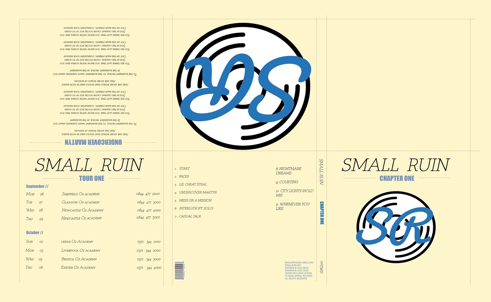
I like your overall design and idea, but I feel like there are a few changes you could make to make it look a lot more professional. I firstly feel like you should reduce it down into a four panel as it feels as if you can trying to fill spaces with text that really isn't needed. I like your logo design, but the background colour doesnt really complement it very well so you could maybe try just having white as the background, and use the blue in the logo more throughout our digipak. Also try sticking to one font as it can start to look messy when you have loads of different fonts on both capitals and small letters. I like the design for the back, but you could maybe put the text just to the left side and have the legal information next to the barcode.

I like your overall design and idea, but I feel like there are a few changes you could make to make it look a lot more professional. I firstly feel like you should reduce it down into a four panel as it feels as if you can trying to fill spaces with text that really isn't needed. I like your logo design, but the background colour doesnt really complement it very well so you could maybe try just having white as the background, and use the blue in the logo more throughout our digipak. Also try sticking to one font as it can start to look messy when you have loads of different fonts on both capitals and small letters. I like the design for the back, but you could maybe put the text just to the left side and have the legal information next to the barcode.
ReplyDeleteThis comment has been removed by a blog administrator.
ReplyDelete